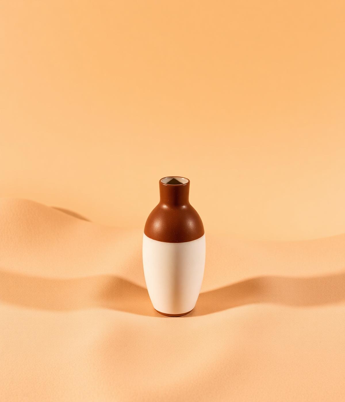
Orla is a small ceramics studio working out of a converted garage in Alfama. They came to us with a growing catalogue, a first wholesale account, and an identity built ad hoc across markets and pop-ups.
We built a system that could carry a hand-thrown pot, a stamped kraft box and a print catalogue without losing its warmth — a serif wordmark, a restrained palette of clay and cream, and a set of stamps and stickers that let the packaging line finish itself in the studio.
A warm, patient identity that reads as clearly on a shelf as it does on a shipping label.
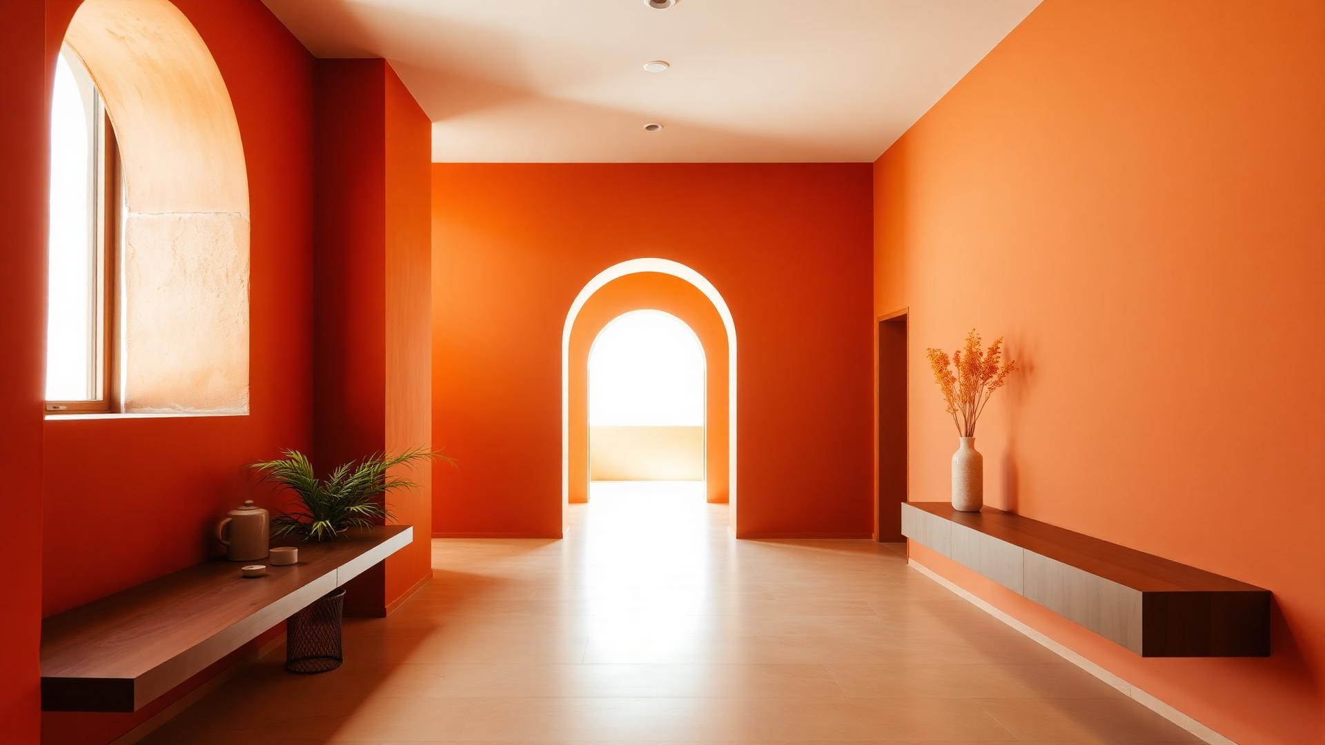
The wordmark was drawn to sit next to the work, not compete with it. A single weight of a low-contrast serif, spaced generously, and paired with a plain sans for prices, dimensions and care notes.
One typeface, a handful of stamps, a lot of empty space.

Packaging was designed for the studio to assemble by hand: unbleached kraft mailers, a two-colour stamp, and a folded card with care instructions on one side and a hand-written batch number on the other.
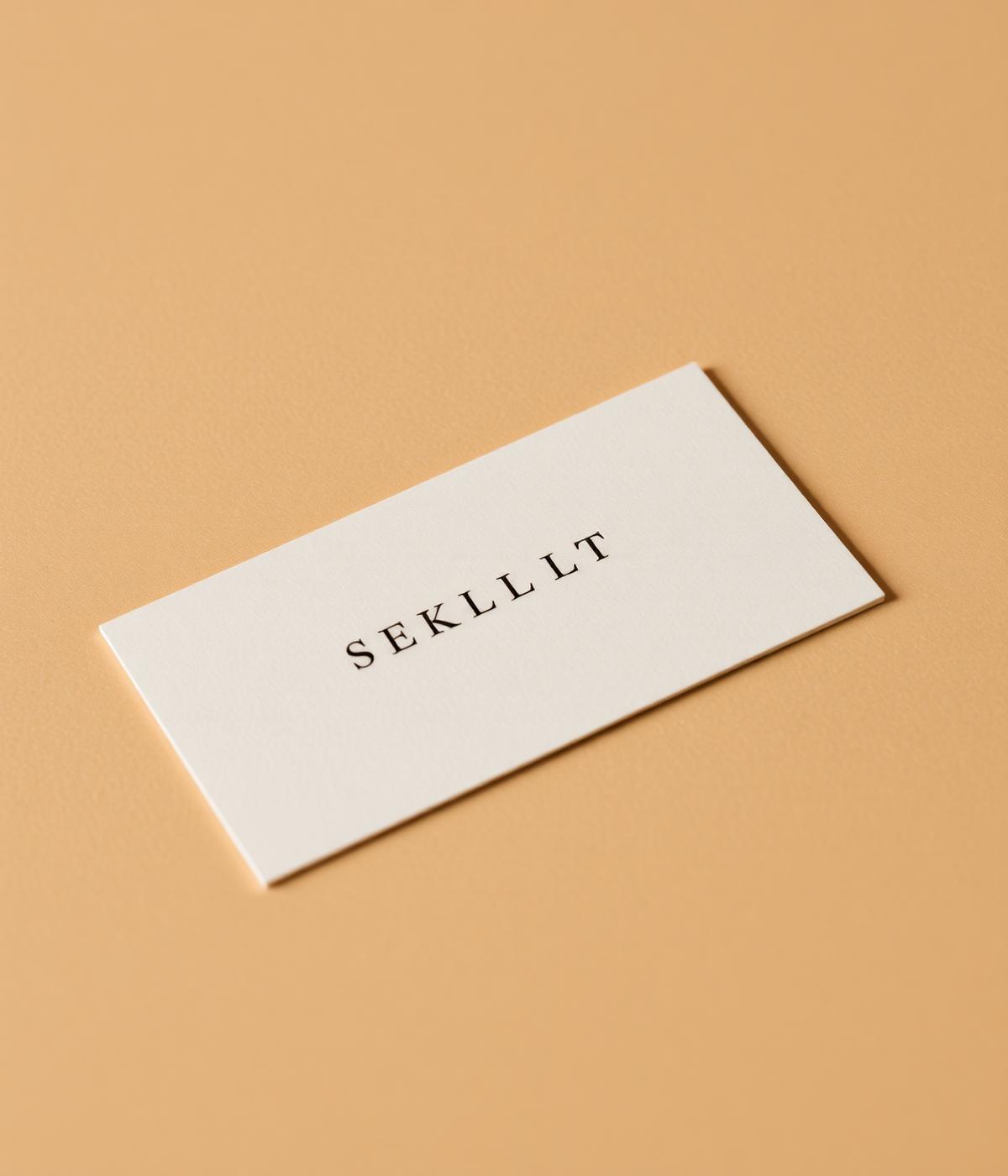
The full print system — business cards, catalogue, price lists and hang tags — was set on a single grid so a new season can ship in an afternoon.
The site launched with the spring catalogue — a quiet, image-first shop with the same typography as the printed matter, and a journal for the studio to post kiln notes between drops.